A Visual Guide on How to Graph Inequalities
Struggling with how to graph inequalities? This guide breaks it down with clear steps for number lines, coordinate planes, and real-world examples.
Graphing an inequality isn't about finding a single answer; it's about creating a visual map of all the possible solutions. For a single variable, this map is a number line where you'll use an open or closed circle and shade in one direction. When you move to two variables, the map becomes a coordinate plane where you draw a dashed or solid line and shade an entire region to show the solutions.
Building a Strong Foundation for Graphing Inequalities
Before jumping into drawing lines and shading, it's crucial to get a handle on what an inequality actually is. Unlike a simple equation like x = 5, which has just one solution, an inequality describes a whole range of possibilities. So, when we talk about graphing an inequality, we're really just drawing a picture of every single number that makes the statement true.
The symbols we use to do this, < and >, aren't new. They were first introduced by English mathematician Thomas Harriot way back in 1631. A few decades later, René Descartes’ invention of the coordinate plane gave us the perfect canvas to visualize these mathematical relationships.
The Language of Inequality Symbols
Getting good at graphing starts with knowing the four basic inequality symbols inside and out. Each one gives you two key pieces of information: where your graph starts, and whether that starting point is included in the solution.
Here’s a quick reference guide to keep things straight:
Decoding Inequality Symbols for Graphing
| Symbol | Meaning | Number Line Circle | Coordinate Plane Line |
|---|---|---|---|
| > | Greater than | Open | Dashed |
| < | Less than | Open | Dashed |
| ≥ | Greater than or equal to | Closed (filled in) | Solid |
| ≤ | Less than or equal to | Closed (filled in) | Solid |
Let's break that down a bit more.
- Greater Than (>) and Less Than (<): Think of these as strict inequalities. The solutions get incredibly close to the boundary number, but never actually touch it.
- Greater Than or Equal To (≥) and Less Than or Equal To (≤): These symbols are inclusive. They tell you that the boundary number itself is a valid part of the solution set.
This simple distinction is the bedrock of everything we're about to do, from deciding on open vs. closed circles to solid vs. dashed lines. Honing your critical thinking skills is a huge help here, as it allows you to see the logic behind these relationships and apply it correctly every time.
Key Takeaway: The most important detail is that little "or equal to" bar underneath the symbol. If it's there, the boundary is included. If it's not, the boundary is excluded. That one detail changes everything about how you draw the graph.
From Symbols to Visuals
Now, let's translate these symbols into a picture. On a number line, this means putting a circle on your boundary number. You'll use an open circle for strict inequalities (like >) and a closed, or filled-in, circle for inclusive ones (like ≥). That circle is your starting point.
From there, you just shade in the direction of the solutions. For an inequality like x > 3, you’d shade to the right because that's where all the numbers greater than 3 live. It’s a simple action that turns an abstract statement into a clear, visual answer. This exact skill is what you'll build on when you learn https://feen.ai/blog/how-to-find-slope-intercept-form for linear inequalities on a coordinate plane.
Graphing Inequalities on a Coordinate Plane
When you move from a simple number line to a two-dimensional coordinate plane, a whole new world of graphing possibilities opens up. This is where you can bring inequalities with two variables to life, like y ≤ 2x + 1. These are incredibly useful for modeling real-world situations, from figuring out a budget to managing time constraints.
It might seem like a big leap, but the process for graphing these inequalities is surprisingly straightforward and logical. You don't need to memorize a bunch of different rules; instead, it all comes down to a reliable three-part approach that works every single time. Once you get the hang of it, you'll be able to graph any linear inequality with confidence.
Establishing the Boundary Line
First things first, you need to draw the line that cuts the coordinate plane into two distinct regions. The easiest way to do this is to temporarily treat your inequality as a regular equation.
For example, if you're working with y > -x + 4, just start by graphing the line y = -x + 4. This is your boundary line. Think of it as the border that separates all the points that could be solutions from all the points that definitely aren't. We cover the nuts and bolts of this in our detailed guide on how to graph linear inequalities.
Deciding Between a Solid or Dashed Line
Now that you know where your boundary is, you have to decide how to draw it. This choice is all about whether the points sitting directly on the line are part of the solution. The inequality symbol itself tells you everything you need to know.
- Solid Line: If you see
≤(less than or equal to) or≥(greater than or equal to), draw a solid line. This means the points on the boundary are included in the solution. - Dashed Line: For
<(less than) or>(greater than), use a dashed line. This shows that the line is just a border, and the points on it are not part of the solution.
It seems like a small detail, but it's critical for getting it right. A solid line means "inclusive," while a dashed one means "exclusive."
This quick visual breaks down the core flow of turning an inequality into a graph.
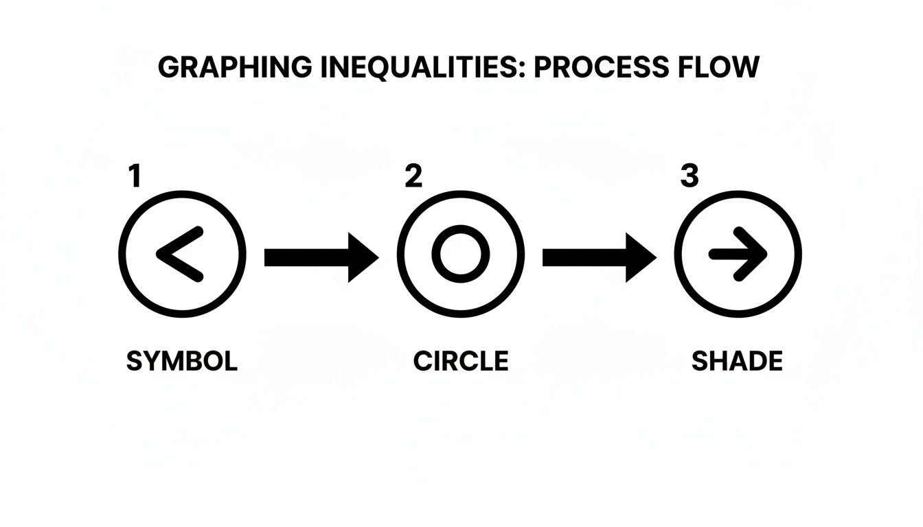
This process—checking the symbol, drawing the right kind of boundary, and then shading—is the fundamental method for graphing any two-variable inequality.
Shading the Correct Region with a Test Point
The last, and arguably most important, step is shading. Your shading shows which entire side of the boundary line is packed with the infinite set of coordinate pairs that make the inequality true. The most foolproof way to figure this out is the test point method.
Simply pick a point on the graph that is not on your boundary line and plug its coordinates into the original inequality.
Pro Tip: I always use the origin, (0,0), as my test point. It makes the math super easy. The only time you can't use it is if your boundary line runs straight through it. If that happens, just pick another simple point like (1,1) or (0,1).
Let's walk through it with y ≤ 2x + 1.
- Plug in the test point (0,0):
0 ≤ 2(0) + 1 - Simplify the math:
0 ≤ 1 - Check if it's true: Yep, 0 is less than or equal to 1.
Since our test point gave us a true statement, we shade the entire region of the graph that contains the point (0,0). If the statement had been false, you'd simply shade the other side of the line. This quick check takes all the guesswork out of the process and makes sure you shade the correct solution area every time.
Navigating Special Cases and Common Pitfalls
Not every inequality you'll face looks like a neat y = mx + b problem. You're bound to run into some special cases that seem confusing at first glance but are actually quite simple once you know the trick. Getting these right, and dodging the common mistakes, is what really solidifies your understanding of graphing inequalities.
Horizontal and Vertical Lines
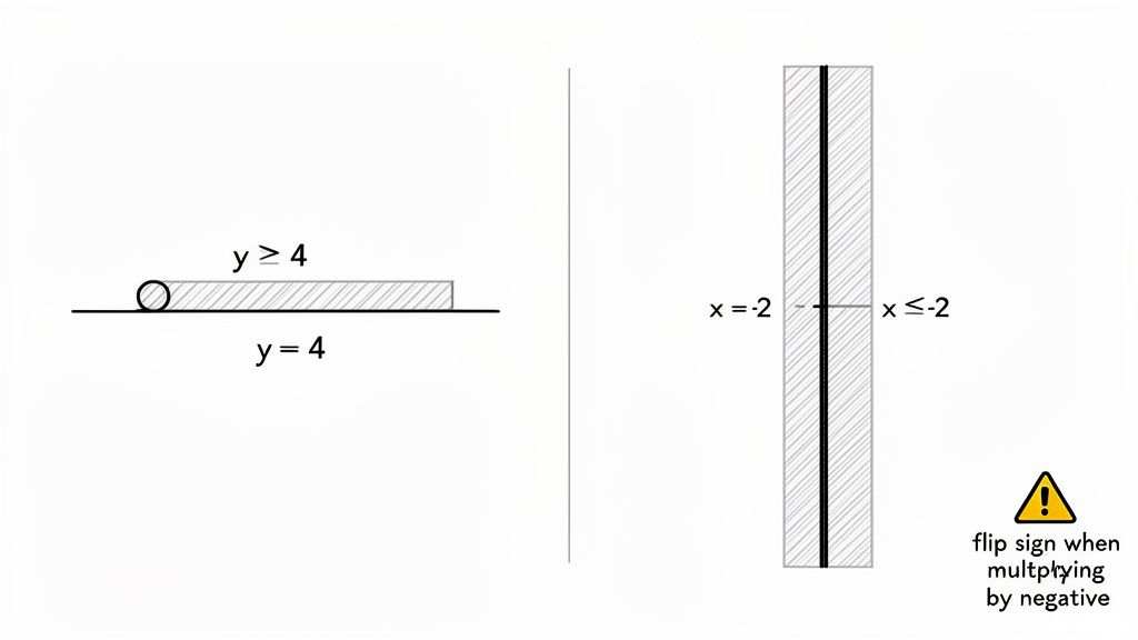
What happens when you see an inequality like y > 4? The missing 'x' variable throws a lot of people off. But think about what it means: the value of y is always greater than 4, no matter what x is. This creates a horizontal boundary line where every single point on it has a y-coordinate of 4.
Similarly, an inequality like x ≤ -2 gives you a vertical boundary line. Every point on this line has an x-coordinate of -2.
Once you have the line, the rest is easy. For y > 4, you shade everything above that horizontal line. For x ≤ -2, you shade to the left of the vertical line, where all the x-values are smaller.
What To Do When Your Test Point Fails
Using (0,0) as a test point is a fantastic shortcut, but it has one Achilles' heel: it doesn't work if the boundary line passes straight through the origin.
Take an inequality like y ≥ 2x. If you plug in (0,0), you get 0 ≥ 2(0), which simplifies to 0 ≥ 0. While that statement is technically true, it doesn’t help you decide which side of the line to shade. The point is on the line, not on one side or the other.
When this happens, don't panic. Just pick another simple point that's clearly not on the line.
My Go-To Strategy: If (0,0) is on the line, I immediately switch to testing (1,0) or (0,1). These points are just as easy to work with and will always give you a clear "true" or "false" so you know exactly where to shade.
Common Mistakes to Avoid
Knowing how to graph these is one thing; knowing where you're likely to trip up is another. I've seen students make the same small mistakes over and over, especially under pressure. Let’s head them off at the pass.
- Forgetting to Flip the Sign: This is the big one. Anytime you multiply or divide the entire inequality by a negative number, you absolutely must reverse the inequality symbol. Forgetting this single step is probably the most common reason for getting a graph wrong.
- Mixing Up Dashed and Solid Lines: It's an easy mistake to make in a hurry. Before you start drawing your boundary line, pause and look at the symbol. Is it strict (
>or<)? Use a dashed line. Is it inclusive (≥or≤)? Use a solid line. - Shading Vertical Lines the Wrong Way: With an inequality like
x > 3, your brain might want to think "up" for "greater than." But remember, you're dealing with the x-axis. "Greater than" means moving to the right on the number line, where the values increase.
Tackling Compound and Absolute Value Inequalities
Once you’ve got the hang of graphing single inequalities, you'll start running into problems that combine multiple conditions. These are called compound and absolute value inequalities, and they pop up all the time in higher-level math.
They might look complicated, but don't let that fool you. They're really just a couple of simple inequalities mashed together.
Graphing Compound Inequalities
A compound inequality is just two separate inequalities joined by the word "and" or "or." That one little word completely changes how the graph looks, so paying attention to it is everything.
"And" Inequalities: Finding the Overlap
When you see an "and" inequality, think intersection. The solution has to make both parts of the statement true simultaneously. It’s all about finding where the two graphs overlap.
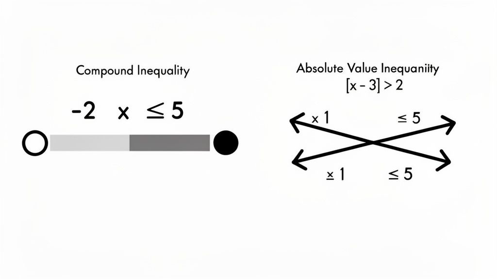
Take **-2 < x ≤ 5**, for instance. This is really just a shorthand way of writing "x > -2 AND x ≤ 5."
To graph it, you'd visualize both parts on the same number line. First, x > -2 is an open circle on -2 with shading to the right. Then, x ≤ 5 is a closed circle on 5 with shading to the left. The final graph is only the section where those two shaded areas overlap—the chunk of the line between -2 and 5.
"Or" Inequalities: Combining Both Solutions
With an "or" inequality, you're looking for a union. The solution only needs to satisfy at least one of the conditions. Instead of finding the overlap, you’re just combining everything from both individual graphs.
Let's graph x < -1 OR x ≥ 3.
First, x < -1 gives you an open circle at -1, shading off to the left forever. The second part, x ≥ 3, is a closed circle at 3, shading all the way to the right. Since it's an "or" problem, the final graph includes both of these pieces, resulting in two rays pointing in opposite directions.
Key Takeaway: Just remember this: "and" means intersection (find the overlap), and "or" means union (combine everything). Nail this distinction, and you’ll graph compound inequalities correctly every single time.
Decoding Absolute Value Inequalities
Absolute value inequalities might look like a whole new beast, but they're really just compound inequalities in disguise. The trick is to rewrite them as two separate inequalities before you start graphing.
Here are the two rules you need to know:
- Greater Than: An inequality like
|x| > aalways splits into an "or" statement:x > aORx < -a. - Less Than: An inequality like
|x| < abecomes an "and" statement:-a < x < a.
This works even with more complex problems. Let's try |x - 3| > 2. Since this is a "greater than" situation, we know to split it into an "or" compound inequality:
x - 3 > 2 OR x - 3 < -2
From here, it's easy. Just solve each little inequality on its own.
x - 3 > 2simplifies tox > 5.x - 3 < -2simplifies tox < 1.
So, the problem we actually need to graph is x < 1 OR x > 5. You'd graph this just like any other "or" inequality: an open circle at 1 shading to the left, and another open circle at 5 shading to the right.
By breaking the absolute value down first, you turn a scary-looking problem into familiar, manageable steps. This strategy of isolating and solving parts of an equation is a fundamental skill that comes in handy later on, especially when you learn how to solve systems of linear equations.
Seeing Inequalities in the Real World
It's easy to dismiss graphing inequalities as just another abstract thing you do in math class. But honestly, it’s a surprisingly practical skill for making smart decisions whenever you’re up against limits. You're not just shading a graph; you're learning how to find the best path forward when resources aren't infinite.
Let's imagine a small business owner who builds custom tables and chairs. They obviously want to make as much profit as possible, but they're working within a couple of real-world constraints.
- Budget: The cost of wood and other supplies has to be less than or equal to their weekly budget of $5,000.
- Time: The total hours spent building can't go over 40 hours a week.
Each of these rules is a linear inequality. When you plot them on the same graph, the area where the shading overlaps shows every single combination of tables and chairs the owner can possibly produce while staying on budget and on schedule. This is how you use a graph to find a recipe for success.
Finding the "Feasible Region"
That overlapping, shaded area actually has a technical name. Graphing inequalities is a cornerstone of a field called linear programming, where people model constraints like 'production hours ≤ 40' and 'material cost ≤ $5,000' to find the most efficient way to operate.
This shared solution space is called the 'feasible region,' and it literally represents all the possible outcomes that meet all your rules at the same time. If you want to dive deeper, you can explore how systems of inequalities are applied in this detailed educational guide from the American Statistical Association.
This idea isn't just for business, either. You start seeing it everywhere once you know what to look for.
Logistics: Think about a shipping company loading a truck. They have a weight limit (total weight ≤ 26,000 lbs) and a space limit (total volume ≤ 1,000 cubic feet). Graphing these two inequalities shows them every combination of cargo that will fit without breaking the rules.
Personal Finance: Say you're setting up a monthly budget. You decide you want to spend at most $200 on entertainment while saving at least $300. Plotting these two conditions helps you see exactly how your spending choices impact your savings goals.
Key Insight: Any time you run into a situation with rules like "at least," "at most," "no more than," or "should not exceed," you're dealing with an inequality. Graphing turns those abstract rules into a clear, visual map of your options.
Ultimately, learning to graph inequalities gives you a framework for thinking strategically. It’s all about understanding your boundaries and then figuring out the best way to succeed within them, whether you're running a company, managing your money, or just trying to balance your homework and your social life.
Your Questions About Graphing Inequalities Answered
Even with the best instructions, a few tricky questions always seem to pop up when you're first learning to graph inequalities. Let's walk through some of the most common ones I hear from students.
Getting these details right is usually the last hurdle to clear before you can graph any inequality with total confidence. Think of this as the go-to guide for those little moments that make you pause and ask, "Wait, what do I do here?"
What's the Difference Between a Solid Line and a Dashed Line?
This is probably the most fundamental question, and thankfully, the answer is built right into the inequality symbol. The line you draw is the boundary of your solution, and you have to show whether that boundary is included in the answer or not.
- A solid line is for "or equal to" inequalities (≤ or ≥). This tells you that every single point on that line is a valid solution.
- A dashed line is for strict inequalities (<** or **>). It acts like a fence, showing you where the solution area begins, but the points on the fence itself aren't included.
My Tip: I always tell my students to look for that little extra line underneath the
<or>symbol. If you see that "or equal to" bar, your boundary line gets to be solid, too.
How Do I Know Which Side of the Line to Shade?
The most foolproof method is what we call the test point method. Trying to guess which way to shade just by looking at the "greater than" or "less than" symbol can sometimes lead you astray, especially if the equation isn't in slope-intercept form.
Instead, just pick a super simple coordinate pair that isn't on your boundary line. The origin, (0,0), is almost always the easiest one to work with.
Plug (0,0) into your original inequality. If you get a true statement (like 0 < 5), you shade the entire region that includes your test point. If it comes out false (like 0 > 5), you just shade the other side. Simple as that.
What if My Test Point (0,0) Is on the Line?
Great question! This definitely happens sometimes, especially with inequalities like y > 2x or y ≤ -x where the line cuts right through the origin. When that happens, (0,0) can't tell you which side is which because it's on both.
No big deal. Just pick another easy point that isn't on the line. I usually go for (1,0), (0,1), or (1,1). The process works exactly the same—you just need a point that gives you a clear true or false result.
Do I Always Flip the Inequality Sign When I Multiply or Divide?
Nope, and this is probably the most common mistake I see. You only flip the inequality sign when you multiply or divide both sides by a negative number. If you're dividing by a positive 2, for example, the sign stays exactly the same. It's only that negative that forces the flip.
Stuck on a specific homework problem? Feen AI can help. Snap a picture of your inequality, and our AI tutor will give you a step-by-step walkthrough to graph it correctly, explaining the why behind each step. Get instant, clear explanations at https://feen.ai.
Relevant articles

Learn how to solve inequalities step by step. This guide covers linear, absolute value, and quadratic inequalities with clear examples and real-world tips.
Learn how to solve exponential equations with simple steps, clear explanations, and real examples.

Boost your skills with quadratic formula practice problems: 8 focused questions to reinforce steps, discriminants, and solving.
Struggling with absolute value? Learn how to solve absolute value equations with our guide, packed with clear examples, common pitfalls, and real strategies.
Learn how to solve quadratic equations using simple methods like factoring, the quadratic formula, and more. Get clear examples and expert tips for any problem.

Learn how to factor polynomials completely using our guide. From GCF to advanced methods, we'll help you solve any algebra problem with confidence.